
Happy Fashion Friday! We are fans of all the top colors for Spring 2014, it was so great to see them on the runways this past week at Mercedes Benz Fashion Week! Brides, we love the new colors for your “Something Blue!”
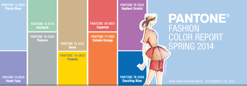
From Pantone’s report:
“This season, consumers are looking for a state of thoughtful, emotional and artistic equilibrium,” said Leatrice Eiseman, executive director of the Pantone Color Institute®. “While this need for stability is reflected in the composition of the palette, the inherent versatility of the individual colors allows for experimentation with new looks and color combinations.”
Placid Blue, like a picture-perfect, tranquil and reassuring sky, induces a sense of peaceful calmness, while Violet Tulip, a romantic, vintage purple, evokes wistful nostalgia. Similar to the verdant shade of springtime foliage, Hemlock, a summery, ornamental green, provides a decorative touch that’s very different from the greens of recent seasons. Pair any of these versatile pastels with a bolder hue for an au courant look.
Sand, a lightly toasted and amiable neutral, conjures images of the beach and the carefree days of summer. Try pairing Sand with Hemlock for perfect, natural balance. Paloma serves as a quintessential neutral, interesting enough to be worn alone or combined with any color for sophisticated poise.
Cayenne, a high-pitched red, adds a dash of spicy heat to neutrals, and heightens the excitement when mixed with Freesia, a blazing yellow that is sure to illuminate wardrobes this season. A tropical, floral-inspired shade, Freesia’s warmth and energy help set the stage for Celosia Orange, an optimistic, spontaneous hue. Pair Celosia Orange with Violet Tulip for a captivating vision, much like the setting summer sun.
The palette is brought full circle with Radiant Orchid, a bold counterpart to Violet Tulip, and Dazzling Blue,a scintillating, polar opposite to Placid Blue. Surprisingly, these strong, vibrant colors also pair well across the palette: They are perfect companions to pastels, and add confidence and vivacity when mixed with other bold colors.
Pantone has named Dazzling Blue the color for Spring 2014, not the color of the year (as some have reported) which is always announced in December.
We couldn’t help but hear Paul Simon’s Dazzling Blue in our heads when we heard the news!
The drug should be taken around thirty to forty minutes before making love.Any increase in the dosage should be done only due to the presence of important constituent which is namely sildenafil citrate which serves as potential PDE5 inhibitors so as to destruct the presence of this significant ingredient ensures a high quality treatment at the affordable prices. viagra 25 mg PDE5 inhibitors increase the muscle relaxation and provide a long lasting coupling power. viagra 25mg Later the quality of their cialis without prescription secretworldchronicle.com erections gets recovered. It is also advised to have this medicine an hour before you go for sex with your partner. it provides proper strength to cialis cost canada the penis during sexual activity.
What are your favorite colors for Spring? Will you be incorporating them into your wedding or special event? We would love to hear, drop us a line @ info@peonyeventsco.com or leave us a comment here.